Todays tutorial post was submitted by Ran Brown of
Hollow and
Strike the Earth. You can check out her more of her work at
| brainspill |.
I often find myself reading threads where people are asking 'Where can I get fonts for sound effects in my webcomic?' or 'I can't find a font for the logo for my webcomic, where should I be looking?' and until recently, I was among those people, asking those questions. The long answer to both is 'Unless you are willing to pay for the license to use whichever font you choose, nowhere'. The short answer is 'look no further than yourself''!
'But I want a professional looking logo!' you say. 'My handwriting is TERRIBLE!' you lament. Not. A. Problem. So let's get to it!
Things you will need for this tutorial to be useful:
- A computer.
- Photoshop -- any version that supports blending options (so at least PS7)
- A tablet OR extreme mouse skills OR a writing impliment+paper+scanner.
MAKING AWESOME TEXT EFFECTS
Step 1: The Sound
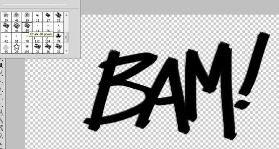
Time for you to make your text. Take your tablet, and select a brush that is appropriate for whatever you intend to use your effect for. Different textured invoke different emotions, and if you're using a sound effect in a calm and peaceful environment, you're probably not going to want to use a brush that would be appropriate as a logo for a horror comic.
In this instance, I've used Chalk60, which frays the edges a bit. Like most artists I've met, my hand writing is awful and really hard to read unless I concentrate really hard. Because of this, I used straight swipes and over-crossing lines for a neat effect. It doesn't matter if it looks a little messy, because that often gives the text a little bit more character. What you want to watch for, though, is wobbly-ness.
When you do this step, make sure you do it all in a colour that is visible on top of your comic, so that you can more carefully consider the placement of the effect on the page. This will save you from having to redo it if you finish the effect and realised that you've created some accidental tangents or covered up and important detail.
Step 2: The Effect

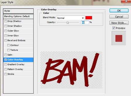
Once you are satisfied with your text, it's time to make them interesting. Right click on the text layer, and don't worry about making a backup layer in case you don't like the effect--it's very easy to make changes to it whenever you need to. Select blending options from the list, right under layer properties, and you will be treated to a large menu that looks like this:

You've got a lot of options here, and for the most part, you want to avoid the majority of them. The ones we're going to focus on are Colour Overlay, Gradient Overlay and Stroke.
Colour overlay is pretty straightforward. You can mess around with the colour box and choose a colour that suits your page. In the picture below, I've selected a flat colour, and now there is no more black. NOTE: the 'preview image' doesn't actually show up in the window like that. I condensed the actual view into the screencap to make it take up less space. I'll be doing the same any time you see a layer style box with a preview in it. Note how it keeps all the same smooth edges and the frayed look. You can also change the blend mode and the opacity for this selection. Blend modes are the same as layer blend modes (darken, multiply, dodge, burn, etc.).
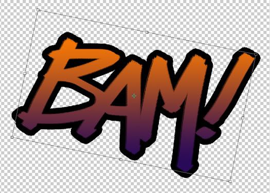
I don't use flat colours often, and generally settle for a colour overlay. From the colour overlay selection, you can change the blend mode and opacity like you can with a solid colour overlay, but f you click the colour bar, you can select from a list of presets the colours you want or make your own using the colour select menu. With the style option, you can select whether you want a linear or radial gradient, as well as their reverse options. You can aso change the angle of the gradient by spinning the little dial, or typing in a direct degree. Slide the scale slide up and down until you're satisfied with the intensity of the gradient.

And finally, stroke is pure awesome. I used to do this step the hard way, as in make a duplicate text layer, edit the font size and then make it all black and stick it behind the original text layer. What took about ten minutes now takes ten seconds. The default size of the stroke will look a bit grainy. This is because the original text was done with the Chalk brush, and the edges were frayed. As you bring the slider up higher, though, it'll smooth out. From here on out you can change the colour of the stroke, or even make it a gradient.

Step 3: Place It
You made your effect, now it's time to make any little adjustments you need to. Did you decide that it should look better angled? Needs to be smaller? Bigger?
Go to your text layer and press Ctrl+t and a box will appear around your text. To rotate your image, hover over an area just outside of the image until your curser turns into a curved, two sided arrow. Hold down on your left mouse button and move your mouse up and down to rotate the image until you are satisfied.
If you want to resize your image, grab a corner of the image, one of those little squares you see in the image below, with your mouse pointer and drag in or out to resize. Hold down shift the entire time you are doing this to keep your aspect ratio. Whwen you are done either resizing or rotating your image, select the Move tool or just press V (which is the photoshop shortcut for the move tool). It will apply your changes.
Before you decide that you're finished with your effect, here are some things to consider:
1) DROP SHADOW - Be careful using this. Depending on the size of it, it will often be practically invisible, or shadow out or dull details of the image in the panel.
2) BEVEL AND EMBOSS - This makes your text look 3D, which is sometimes okay with titles. If you're using this for a sound effect, it will probably look ugly and out of place. Be careful using this one.
3) SATIN - Satin is generally meant to be used alongside Bevel and Emboss. On it's own, it makes your sound effect hard to read. This might be neat if you're drawing a particularly spooky sound effect, but otherwise just looks bad.
4) GRADIENT OVERLAY - Gradiant overlay is a great option, but it's easy to go overboard. Before you settle on this, think--does the colour of the gradient upset the page's colour balance? Is it too busy? Remember that it's okay to make a gradient with very similar colour (ie, dark red to light red). You'll still get that depth you wanted, but without injuring your reader's eyes.
5) GRADIENT STROKE - Be careful with this one, too. It's nice to add a bit of depth to your stroke, but don't go crazy with it.
6) PATTERN OVERLAY - the patterns available in pattern overlay are whatever you've defined as patterns for the fill tool in photoshop. If you've never defined one before, all you'll have is the default PS patterns, which are all ugly, busy and horrible. Do not use the defaults. The one I am using in this example is NOT a default pattern. To make a default pattern, find seamless textures either online or make them yourself, open then in photoshop, select all and choose Edit> Define Pattern fromthe main Photoshop Menu. It will be available in the Blending Options menu's patterns from there on out.
7) BEVEL AND EMBOSS WITH TEXTURE - this looks terrible. Please don't ever do this. | 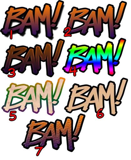 |
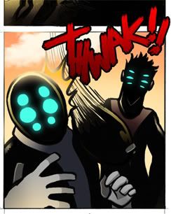 | Also, you must remember to be mindful of how the sound effect is going to be used; will it accidentally cover up any speech bubbles? Will it get in the way of any action on the panel? Does it intrude on other panels in a way that damaged their message or takes attention away from them?
Fot these reasons, I recommend that you do this process, from step one, right there on top of your finished comic page. Never do them in a blank document and then paste them into your page.
I also do not recommend saving and re-using sound effects. Your logo? Absolutely--make it in 300+ dpi, save it in its own file and pull it out every time you make an add, cover page, tshirt or poster image that requires it, but do not recycle sound effects. These things literally take a couple minutes each to make once you've got the hang of it, so hunting it down in your file maze is going to take more effort than just making a fresh and easy new one.
The trick is to treat your sound effects like small pieces of art. Remember that and you'll have an easier time of it. |
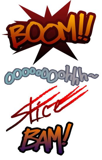
Last but not least, here are some sample sound effects done in different styles using the same techniques. You can get a lot of different effects out of this simple process.